After deciding which 10 sounds to choose for my project
Take 5 I needed to try out different media and line work, to determine which drawings best represent the sounds.
I did this by listening to the tracks on repeat and drawing as it plays, then I further experimented with the same line work but in different media to see which lines look the best.
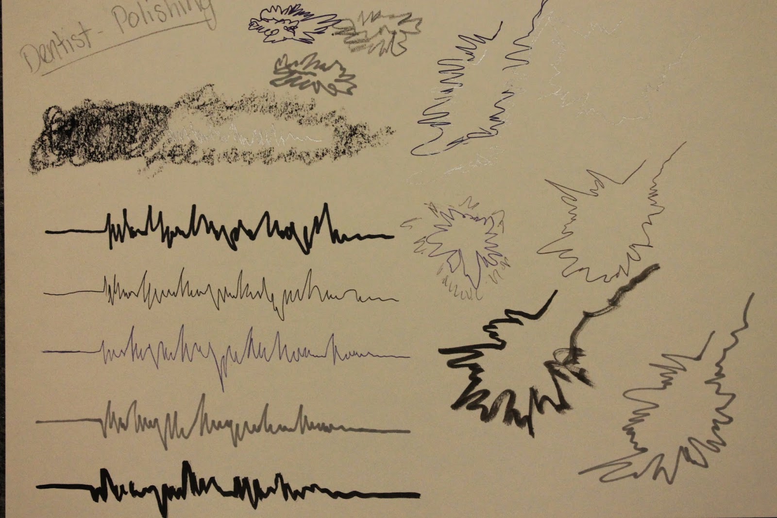 |
| Dentist Polishing |
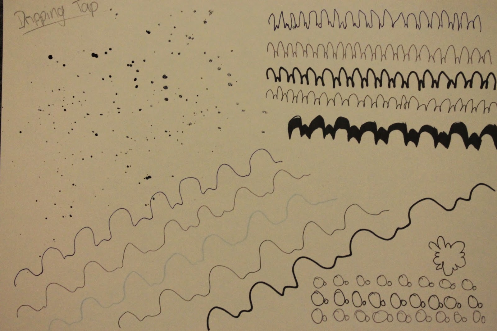 |
| Dripping Tap |
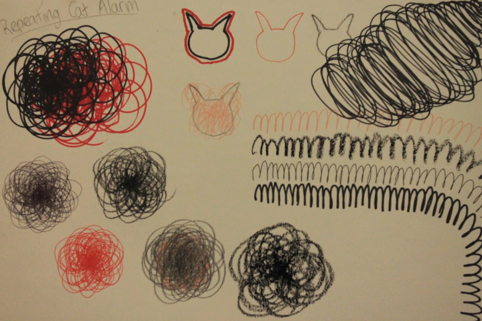 |
| Repeating Cat Alarm |
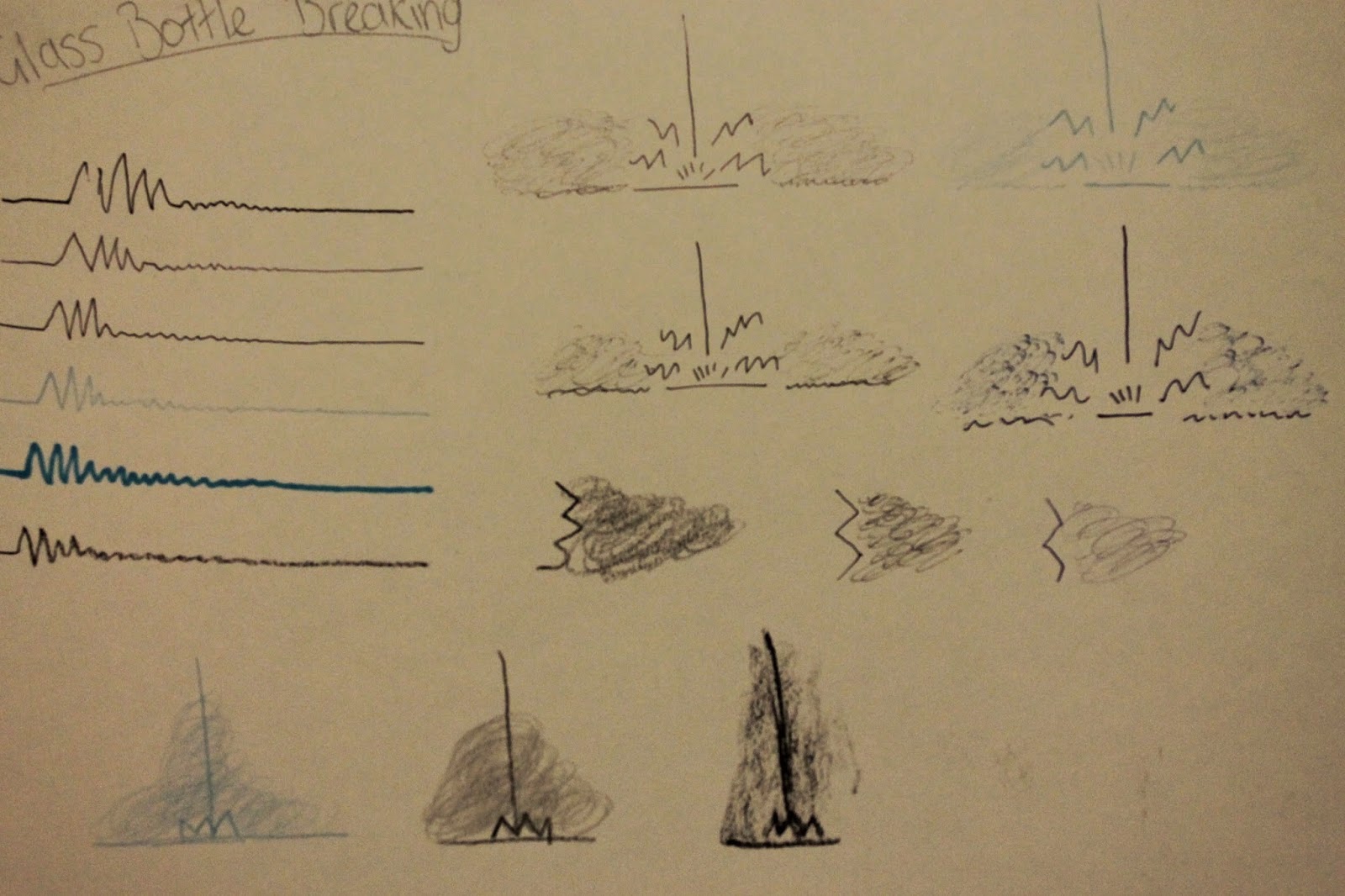 |
| Glass Bottle Breaking |
 |
| Custard Pie |
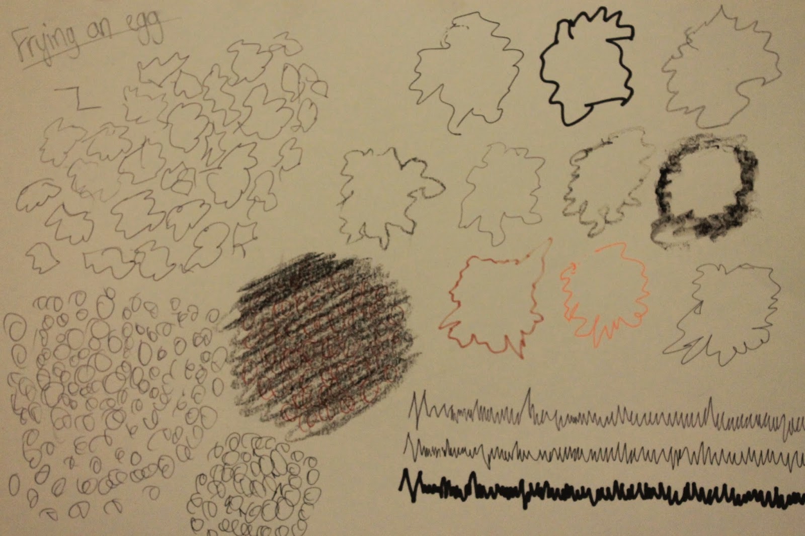 |
| Frying An Egg |
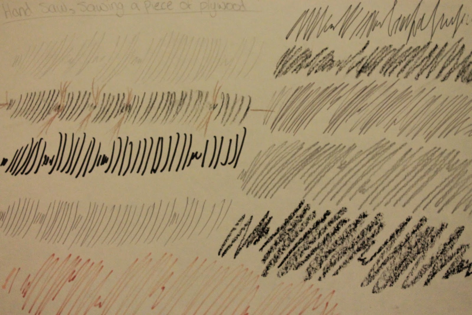 |
| Sawing a Piece of Plywood |
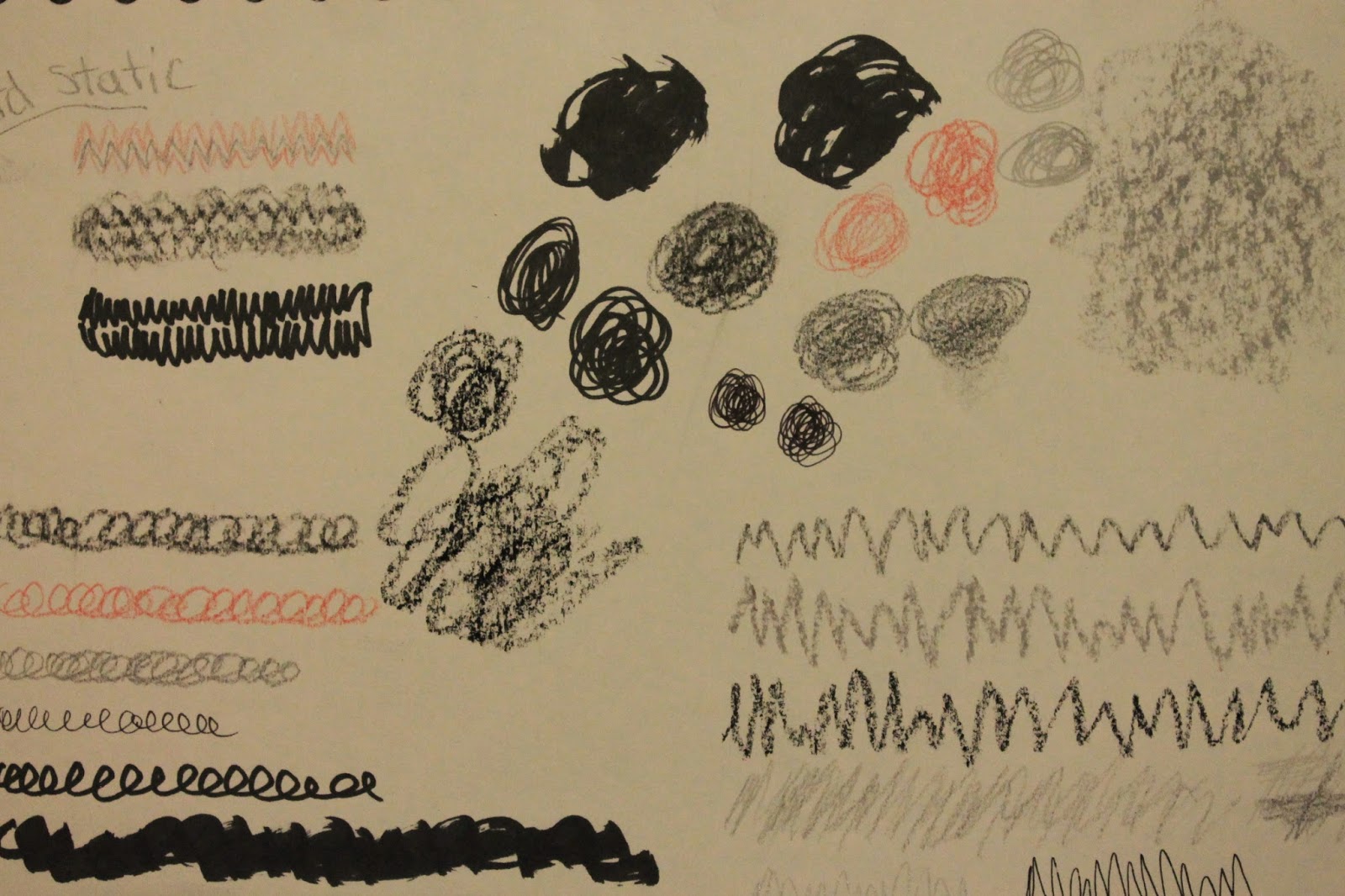 |
| Hard Static |
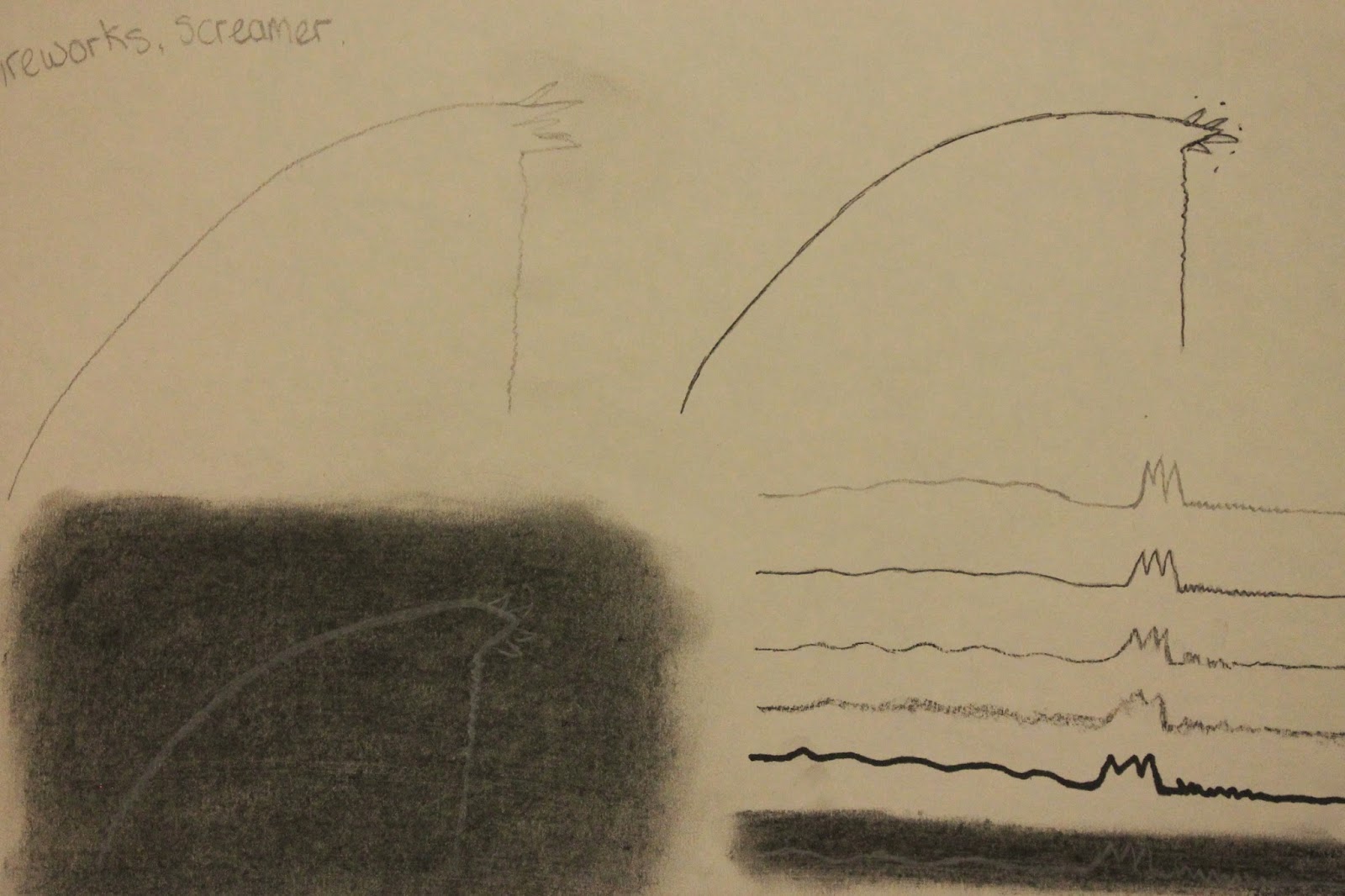 |
| Fireworks, Screamer |
 |
| Cartoon Bloop |
After reviewing all 10 pages, I decided on my final 5:
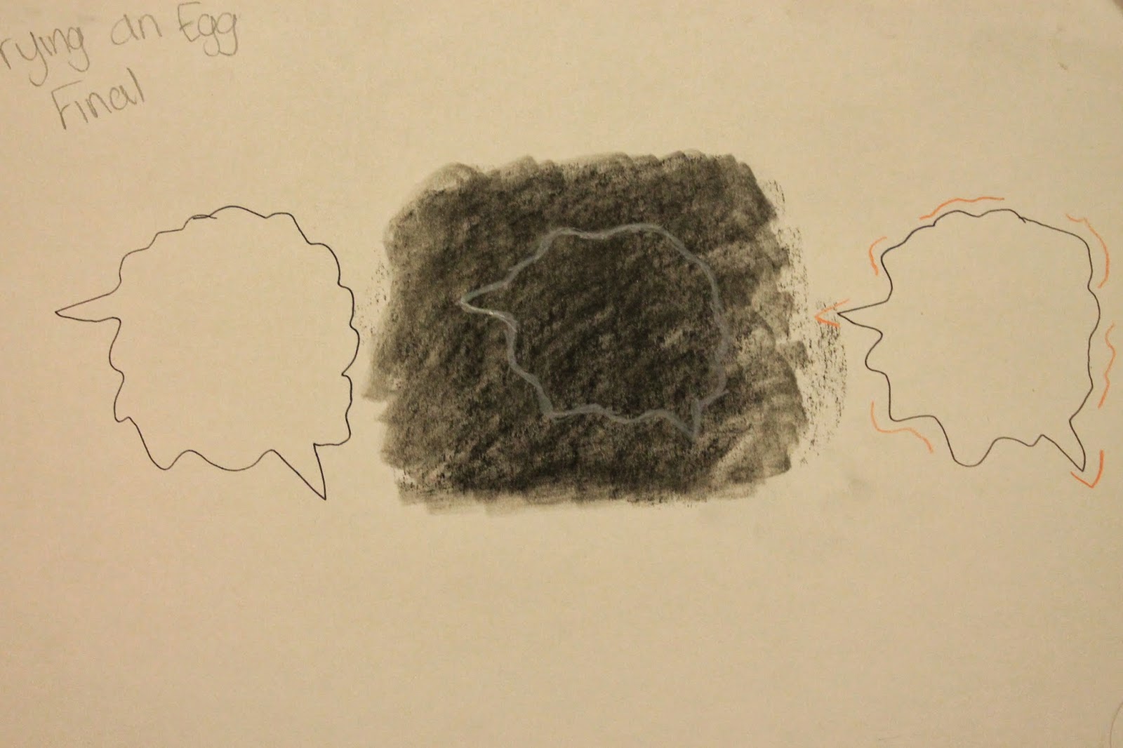 |
| Frying An Egg |
The idea of having a central circle, which is wavy and moving in every frame, I think represent how an egg fizzles as it's cooking. I also added the pointy edges to show how it occasionally spits out while it's fizzling, I want to put it on a black background with white and orange lines, because I think that will allow people to focus on the drawing compared to the sound easier.
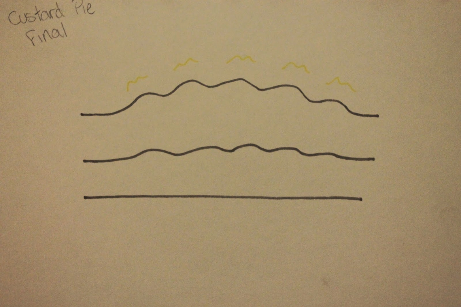 |
| Custard Pie |
I want this to be a simple motion, with smooth curves to represent the soft splat; so that's why I think a simple timeline would be best to represent the simplicity of the sound. Grey is a softer colour then black, which is why I would rather use grey to complete this animation.
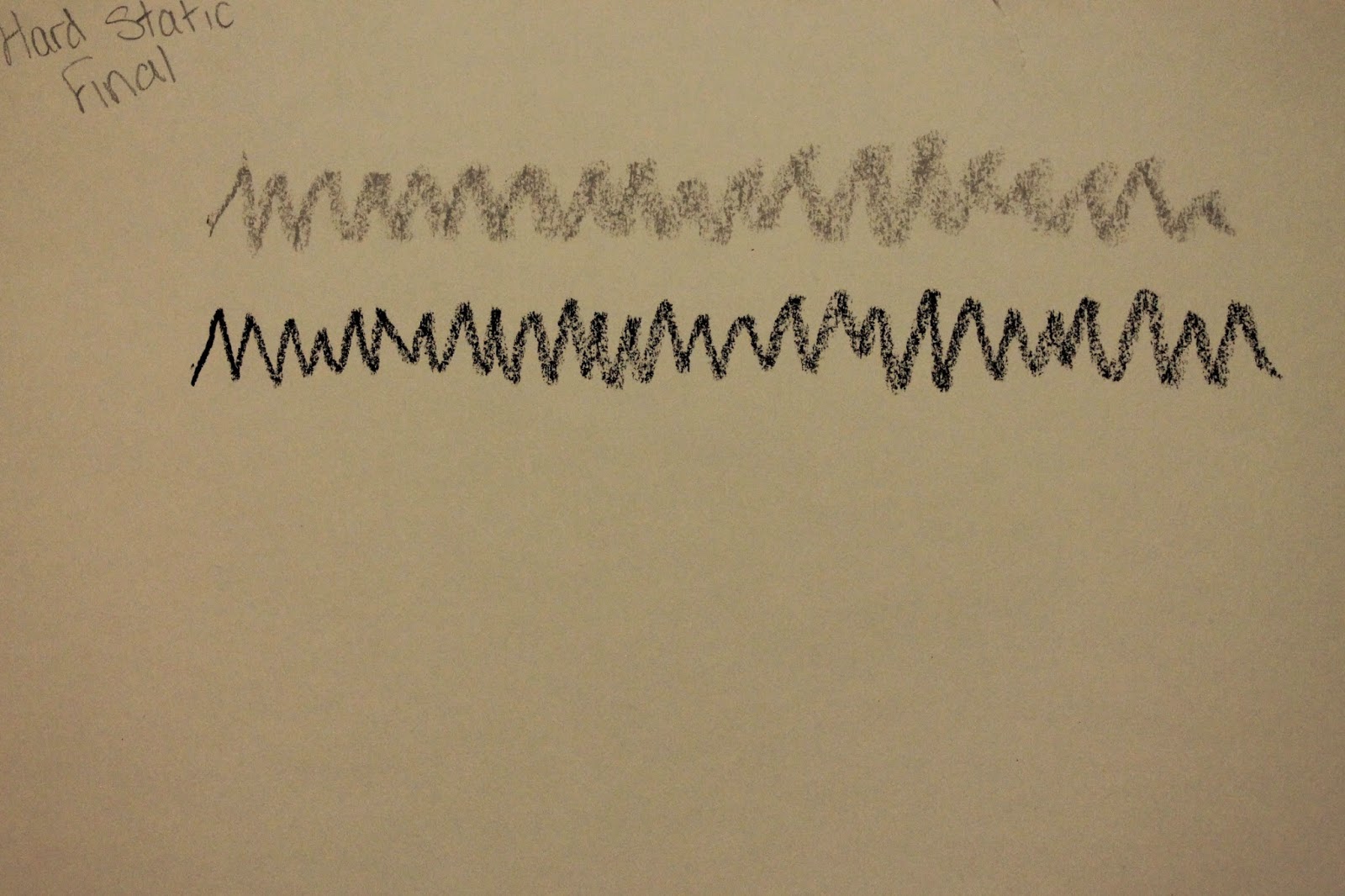 |
| Hard Static |
I feel the texture of the line for hard static should be bitty and not bold lines, because it doesn't have one particular focus point and sounds as if it's surrounding you. After drawing both of these lines I've decided the grey would better represent the static, since it's slightly fainter.
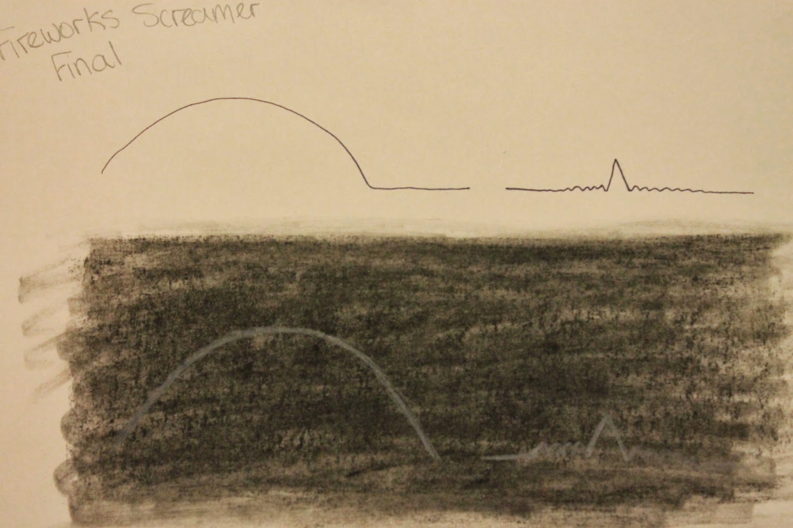 |
| Fireworks, Screamer |
A black background with white lines, I think, is the best way to portray a firework, because they are naturally used at night, so going down this route will make it more obvious as to what I'm drawing. The line goes up at the start, because the sound rises then falls, so I want to try and emulate that in my animation. The small pop at the end with the ripples that follow should be shown in small lines that move quickly.
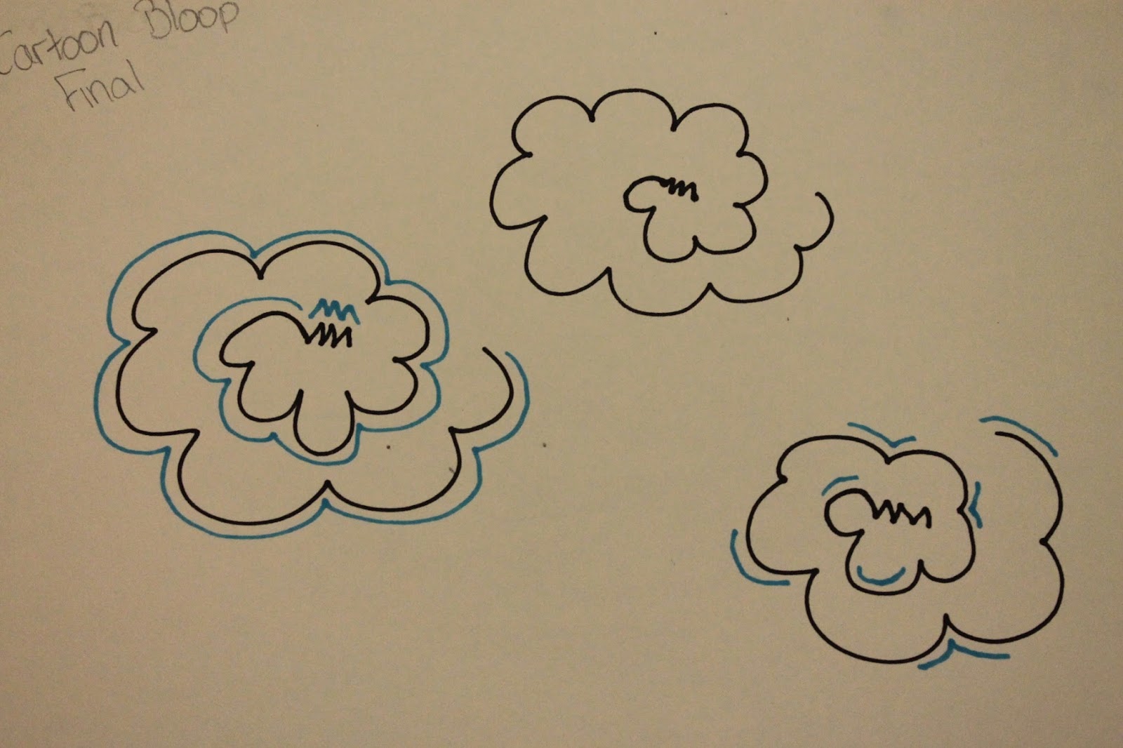 |
| Cartoon Bloop |
I think the best way to show the springy, recoiling sound is to have the lines curving around on themselves, such as what I've drawn above. I will have it appearing from the centre to start, and disappearing towards the end, as the sound calms down. The blue lines around the outside will represent the slight echo that plays around as it coils.