Saturday 31 January 2015

Qwertee - Initial Mockups

My final Stitch t-shirt design is almost ready to be submitted to Qwertee! I created a couple of mock up layouts with my design on a t-shirt and the background image, to show how it would appear on the website.

Qwertee provide you with a downloadable mock up kit with all the possible different coloured T-shirts they use, potential backgrounds for your T-shirt to be shown on, and the opportunity for you to put your creative spin on your design.

The default image on the mock up kit
After you have read through the guidelines appearing on the default image - seeing the guidelines where your image can be placed on the shirt - you can hide or delete the writing and put your design and background (if you wish) onto the Photoshop file.

Once I understood this, I uploaded my image onto this file, changed the colour of the T-shirt and moved it to the right hand side. I did this so I could fit a close up of my image in the background so that viewers can see a detailed version of the image. My main problem was deciding what colour to have my background; I knew I wanted to have it a shade of blue so the image doesn't look too different from the T-shirt, so I picked 2 shades from the T-shirt and tried them both out:


The lighter blue gives the image a brighter impression, but the darker blue allows you to see every colour more clearly. Despite this the darker blue is a much similar shade to the T-shirt, so it doesn't stand out as much as they are too similar. It's because of this I decided to use the lighter shade, the most important aspects of the image are the detailed version and seeing the T-shirt in a full layout; as long as both are visible and the T-shirt looks good then I am happy with the image.

Tuesday 27 January 2015

Qwertee - Colouring Stitch...

Since I'm only allowed to use 6 colours within my design (on a lighter shaded T-shirt), I had to adjust certain aspects of my original plans.

For example I wanted to colour the frog in green, but I had already used 6 colours for the rest of the image, so to make it stand out slightly I used the halftone tool on Photoshop.

A problem I encountered with that tool is that the colour appears checkered. In the end I decided that pattern on the frog works well to make him stand out from the waves around him, and I have added little details to the waves too which help the whole image look good as a whole.

After I had decided this, I just had to choose between a lighter or darker shade for the frog's head. The original character has a green head and a lighter stomach, but I couldn't achieve the right shade of the stomach so had to improvise. I tried two shades for the head, a lighter and darker (as shown on the left) and decided the darker looks best.


I also used the halftone pattern on Stitch's shadow on the surfboard and on the lighter shade in his mouth. Both of these worked better than the frog, particularly the lighter shade in the mouth, because it adds an interesting tone to the image and gives it a quirky look.

After applying these qualities to my piece, I think the overall image looks more detailed and full of life, which is how I want this design to look!


Monday 26 January 2015

Qwertee - From Page to Photoshop

After deciding to develop my initial Stitch design, I had to transfer my drawing from my moleskine to Photoshop, so I can make the appropriate changes to turn it into a design.

Firstly I removed the line running down the centre and made the background the same colour, changing the contrast and levels to make the black and white clear and thicker. After this it was time to adjust it slightly so it could work on a T-shirt; I didn't change any of the lines but I thought adding a circle around the waves would give it the impression that he surfed through the circle. I think this addition makes my design look more interesting and completes it, since in the original I let it run to the edge of the page.

Original drawing
Final design
Now that I have my final layout, I can make the background transparent and add colour to it!

Loop De Loop - Change of Plan for Faces

Since I can no longer submit my idea for 'faces' to Loop De Loop since the deadline has passed, I have decided to finish the animation regardless, since I want to practice and improve my skills, but just focus on getting the movement right rather than designing a face for it. The concept will still be there but due to me working on other projects I won't be able to fully finish this piece.

I have made a storyboard and will go ahead with this final idea:


Even if not many people can see it I hope it helps me in my animation progression so I have improved for future films I make!

Wednesday 21 January 2015

My Final Piece

After many hours of animating and modelling, I have finally completed my idea:


Character & Narrative Final Piece from Alex Neild on Vimeo.

Overall I am happy with my work. I have learnt so much during the past few months about using 3D software and translating my ideas from a 2D to 3D platform.

I will take everything I have learnt on board to improve my work in the future!

Tuesday 20 January 2015

3D Modelling for Stop Motion

Due to the growing digital age, stop motion has had to compete with major 3D films that were being released around the same time. However recent stop-motion films such as 'Coraline', 'Paranorman' and 'The Boxtrolls' had a refined technique that makes good use of the modern technology which has been available during recent years.

The company behind these three films is Laika; founded in 2005, so far they have had great success with combining 3D modelling and stop motion. They create the facial expressions on a computer, which were then printed (the time it took varied with how big the face is) using their 3D printer, the printed facial panels were covered with a special white powder while in this process; After the white powder is brushed away the artist is left with a facial panel, in colour, which are then sanded, dripped in glue, tested and sprayed with a few clear coats. This is done with every single print in order to keep them consistent with each other.

Compared to 'Coraline', 'The Boxtrolls' characters have a lot more detail, such as rosy cheeks and more panels which allows more of the face to move; This shows that they are improving their work in all aspects, even within their current technology, which you can see below with the main character from each film:

Coraline's facial expressions
Norman's facial expressions (Paranorman)
Egg's facial expressions (Boxtrolls)

This process has helped stop motion practitioners achieve detailed designs that would have been hard to consistently re create had they gone through the process by hand. It has overall helped companies such as Laika make better quality films with subtle details that help audiences believe their stories.

Sunday 18 January 2015

From 2D to 3D Animation

Traditional, hand drawn animation has been around for several decades now, through feature length film, cartoons, and short films being the main 3.

Disney have been one of the main contributes to the 2D animation industry. They created the first ever animated feature length film, Snow White (1937), which is an amazing feat in itself; With 54 feature length films to their name, they still continue to create films to this day.

Cinderella's transformation, a truly memorable moment in film

However, other animating techniques and companies have become just as popular, if not more so, than Disney.

Pixar are one of the biggest and well known animation companies in the world. Primarily based in computer generated imagery, they started out in 1986 making animated shorts for 9 years, where they demonstrated their skills to the world with a small taste of what was to come from their skilled animators.

Their first feature length film, Toy Story (1995), was an instant hit and gained them the popularity they deserve; It became the first feature length film to only use CGI throughout a whole hour and a half, which at the time excited and amazed their audience. This has since given a fresh variety of films for the world to watch, showing off technology that wouldn't have been possible during Disney's era.

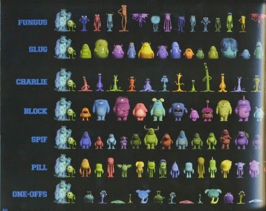
Recent films such as the Toy Story franchise and Monsters Inc have shown how amazing Pixar are at creating a good story in beautiful environments (such as the image below), playing on the imagination of children and putting a new spin in storytelling. These stories were told brilliantly through the use of CGI, and would most likely have turned out very differently if they had been made with hand drawn imagery.

For example looking at the concept art compared to the final look in Toy Story 3, the computer generated piece brings the room to life and has a realistic look to it, which helps the viewers to believe that the toys in the film could actually come to life; Whereas in the drawn version, the toys wouldn't look as alive as they do in the 3D world.
With 3D characters, Pixar have created the illusion that you can pick up one of the toys right out of the screen and it would feel just like any other toy a child has. I think this is a nice concept that has never properly been achieved before, and could explain why the film became so popular.

Toy Story 3 concept art
Toy Story 3 final render

Interestingly, Disney and Pixar became partners in 2006 and started releasing films together; Disney's name appears on films made by Pixar while Disney have started making CG features, such as Tangled and Frozen. This suggests that both companies saw the advantages of the others techniques and wanted to make the most of that.

So the question is does this make computer generated animation better than traditional techniques? I think both companies have inspired aspiring animators such as myself that anything can be possible, Pixar in particular took a big leap into the new technological world, despite having competitors of a different, well established technique, and proving to many that 3D animation is possible and fits in well with the digital world.

Saturday 17 January 2015

Moo - The Final Pitch

The final pitching session involved us being split into bigger groups, of 6 or 7, to each have a go at talking about our boards and intentions with the project. After this we got into pairs to look at two other's pitch boards to silently write feedback down for them; once this was done we had to move around the room to another table to give feedback based on what we can see. These are the feedback forms I received from the session:


Generally, the presentation of the work has been perceived well, with my professional manner and the reference to the brief I have picked being obvious. They also thought my idea is good, but it looks un developed and needs to be drawn with better quality lines; I am aware I'm not that good with photoshop brushes or design work, but my intent with this brief was to practice those things, and I have certainly learnt from this whole experience.

If I continue with developing the content for this brief, I will revise my business card designs - drawing them in a better quality and considering what other content they could have. Whether I'll get time to animate the work before the deadline, I don't know, but I will see how the module goes with the other competitions I contribute too and see if I have time to come back to this. I have gotten most of what I wanted to take from this experience, with learning about effectively pitching an idea and presenting it, so I would be OK to leave it as it is for now.

Changes Based on My Feedback

So after the feedback I got yesterday, I have made some changes to my animation.

Firstly I wanted to add more movement in my first scene. I wasn't sure how to do this, but one good part about it is the breath at the start, so I decided to keep that same movement, but put the arms in a slightly different position at the end and extend the head movement further to emphasise his tiredness.
Once this was in place, I felt the action through the rest of the sequence should have just as much movement, so thought a common action everybody does is scratch their head. It was difficult to make the arm and fingers move smoothly whilst scratching but I am relatively happy with the final result.


Most of my feedback said to add in more follow through action with the arms; which was my main focus for the second scene. The main problem with it originally was the left arm didn't move very much so the body looked quite stiff. As the arm swings back and forth I made sure the elbow and wrist overlapped the shoulder's action slightly.
Just before the third swing I wasn't sure how to move the left arm, because realistically it should swing in the opposite direction as the right arm, so the action wouldn't have looked right if I had moved it too early; so instead I made him clench his fist as it was still in the air, whilst the right arm was still swinging around his body.


For my third scene I also wanted his left arm to move more; so I put in an extra swing when he leans forward while saying "wax" and bent his elbow slightly in places. I think this adds more life to the character and makes him looser.
I also extended his lean forward and heightened him as he says "do the laundry", which emphasises those phrases and keeps him from looking stiff.


I put all three playblasts together into one video to see how they pann out.
I think overall the feedback I received makes my animation look better than it did before! I will re render each scene and add in a sound effect on the broom and cloth as he moves.


Animation and Live-Action Combined

The development of technology within the past 20 years has allowed filmmakers and animators to extend their skills in a variety of ways.

Despite the lack of technology in the 80's, filmmakers and animators came together to create the film 'Who Framed Roger Rabbit?' using robotic contraptions to move the props as the cartoon characters would, training the live action actors to be able to focus on certain points and react at the right times, and having skilled animators such as Richard Williams to work over the top of the film footage.

An example of the actor interacting with the cartoon

It was a big risk to take well known cartoon characters and adapt them to a live action environment, which ultimately worked out as successfully as the creators had hoped.

The technology that is used today by companies such as Double Negative would be able to achieve a similar look to this film, except it would be slightly cheaper to run and the characters could look more detailed. However in a way, it was more impressive that the filmmakers in the 80's to create a film this advanced for its time, due to their lack of modern technology, so they had to improvise and use tricks to merge both mediums.

After saying this, pretty much any idea can be brought to the screen now with the use of CGI, so there is a lot more potential in the future of film to apply those special effects and animated characters to anything.

Friday 16 January 2015

The Simpsons

One of the longest running television shows to date is The Simpsons. It tells the many stories of a suburban family who run into problems or wreak havoc in their hometown of Springfield. Just looking at the picture below you can see their different personalities shining through.

A picture of the main family
All five family members are quite stereotypical; Homer, the man of the house, blunders his way through life trying to support his family. Marge is the mother who keeps the family together, she is empathetic and takes good care of her children and husband. Bart is the troublemaker of the class, he skateboards, pulls off a lot of pranks and gets himself into detention (as seen in the title sequence). Lisa is a bright eight year old who enjoys music and gets excellent grades - the classic "geek". Maggie is the baby of the family, she is unable to talk due to her age but she seems to have a good idea of what is happening.

Homer Simpson
The style of the characters designs are reflected throughout the whole of their universe, so they seem normal compared with the background characters. Saying this their designs in particular are unique; for example with Homer, he has a big round stomach, a grey area around his mouth and a few hairs on top of and around his head.

Observing the picture, he isn't drawn with many straight lines (those next to his ear), which I believe is a tac tick to make his character look more appealing to the audience and represent his enjoyment of food and beer as he grows older.

This is the same with every member of the family; Marge's hair is blue and put up, which is unique and stands out compared to the background characters; Bart has a round stomach just like his dad, and with straight up spiky hair, suggesting his troublesome nature. Lisa and Maggie both have the same hair style, which suggests it runs through the families generic line, but Lisa's necklace shows that she has taken inspiration from her mother.

During the Simpsons episodes, the main characters come across a lot of fellow townspeople, who all have personalities in their own right and add some humour when it's needed.

There are subtle differences in the general designs of the town, such as all of the women have eye lashes, whereas the men don't, which is traditionally a feature that females take more care of. Apart from these, they have all been templated on the same visual style and colour scheme, which I believe works well for keeping their universe the same.


Feedback from my Final Crit

This is the film I presented in my final crit earlier today:


The feedback I got was mostly very good;

The grey objects on white background give my piece a tone that's quite bland and simple, which describes my character very well.
They also said the lip syncing was done quite well, and my voice acting for it also adds to the tone of the piece and compliments the characteristics of Moom.

Overall the class agreed it is a simple yet effective piece that was a great first attempt at using Maya!

A few points that I could improve are adding in overlapping and follow through actions - particularly in the arms - to loosen the character up a bit and give him more life.
I could also add in a sound effect as the cloth in the third scene is moving across the window, and turn up the volume slightly on my brush sound effects.

I can set aside some time within the next week to alter these points and make my animation even better!

Sunday 11 January 2015

Pink Panther

One interesting character that has been re-made over the years is Inspector Clouseau from the film series Pink Panther.

He is supposedly a helpful hand to the police, but his thriving confidence and clumsiness result in a series of blunders that distract and help the criminals to escape sooner than they could have. However despite these mishaps, he still manages to solve the case - eventually.

With every re make, animated or otherwise, he has been accessorised with a hat, moustache and suit, all of which assist with the portrayal of a man who is very confident with his work and his looks. This being said, it is his actions that speak loudest; his upright stance suggesting authority among everyone else, the way he handles artefacts shows how oblivious he can be sometimes, even his accent makes him sound slightly arrogant.

However it is these traits that make him an interesting character and enjoyable to watch, the audience asks themselves how can such a man become an inspector? And a good one at that.


Monsters University

How do you create a monster with a personality? Pixar answered this with their popular films 'Monsters Inc.' and 'Monsters University'. The first describes what happens on the other side of a cupboard door, visualising the theory that children see monsters in their room at night. And the second is a prequel to the first, telling the story of how the main characters got to their position in the first film.

In Monsters University, the artists had to alter their designs in order to make the prequel setting believable. It was set in the 80's, whereas Monsters Inc took place in the 90's, so it was interesting to see the subtle changes between films.

The character designs didn't change too much between the films, but "a hook" was added to the university students to make it obvious that it was the same monster but younger, such as Mike's retainer, and Sully's hairstyle/size.


Randal has an interesting character development, because at university he is wearing glasses which portray his originally nerdy personality, which kept the audience curious as to how he changed from a good student to the evil character in Monsters Inc.

Another way to keep it relatable to the audiences was to re create the stereotypical feel of the American university lifestyle with sororities and traditional campus grounds, but adapting everything to how the artists envisioned the monstrous world.


The background characters add to the atmosphere of the film; the designers created a few main types of monster to feature, then adapted each design to look slightly different, using a certain colour scheme and having a body structure for reference.


Every aspect of a film is important to telling a narrative, especially a prequel/sequel because the audience already has an idea of how it could look.

It's All Coming Together...

I've started animating on my second scene for my film 'When will my life begin?'!

I took 'test 2' as a trial run as a way for me to get used to moving Moom. I will make the first sweep arm movement start earlier so that Moom isn't standing still for too long, and the head/body will twist around more as the arm moves.


After evaluating what I did on the test above, I decided to start again and try to extend my movement further so it flows more naturally. I am a lot happier with the second trial I did because I added in a more natural twist in the upper body and foot as he turns around to sweep next to him. The left arm also swings behind him as he moves forward with the broom to try and emphasise that movement.


In my first scene I have now added head movements:


I think this looks better than my previous tests because it gives him more life, despite him being tired.

Now I will start rendering these scenes to watch them in high quality.

Saturday 10 January 2015

Progress So Far... Lip Syncing!

So far I have lip synced and animated 2 out of 3 of the scenes for my final piece.

The scene I have left to do is my longest one with the most movement of the character... I decided the first part I should move is the face, because this way it's in the same position and I don't have to think about it on top of moving the body:


I have also made progress with my third scene, with the lip syncing and body movements involved, and I have the objects in the background which I test-rendered earlier.


The next task I need to do is animate the body in scene 2.

Qwertee - Fine Liner Fun!

After trying out a few potential designs for Qwertee, I have decided I like this style the most. I have initially drawn for One Piece, Lilo and Stitch, Iron Man, Spongebob Squarepants and Professor Layton in my moleskine notebook:

One Piece
Stitch
Iron Man
Spongebob Squarepants
Professor Layton
I chose to draw them in this style because it was enjoyable and I can adapt it to suit any character I decide to use. 
After contemplating these and deciding which would be most appealing to a wider audience I am going to develop on my Stitch design; I believe it has a lot of potential and when coloured in with bold colours it could look good and stand out, and based on my research into other Qwertee designs Stitch seems to be a popular subject among other designers.
I will go ahead with the first design and if it receives positive feedback then I will contemplate developing another design or two in this style.


Qwertee - Idea Generation and Inspiration

I found a series of images that appeal to me in different ways. The first three in the notebook are very well illustrated pieces with a centre point of the viewers attention - this layout is very interesting to me, because so much detail has gone into it and the potential with it could be amazing. I could try and replicate this somehow, maybe with well-known characters as the centre point instead of generic things.

The last image contains a mood board I put together of similar, previous Qwertee designs which fit to a particular style. This technique could also be interesting to look into, it would be a good way to learn the different paint brushes and tools available in Photoshop.


Toy Story

The first ever feature length fully computer generated film, and still one of the best creations from Pixar, is Toy Story.

The narrative describes the life of a child's toys, and how they come to life as soon as he leaves the room.

Two main characters rival each other for most of the feature, until they realise they work better together, to re unite them with their owner after they both get lost.

The first of these two is Woody; he has been with the child since he was young and is the leader of the other toys Andy owns.

Woody is a sherif cowboy, which is made obvious by his outfit and attitude. Certain qualities such as his elbows and knees help viewers to understand that he is a toy; the textures on his face and hat also assist in portraying this.

He is a likeable character, and Andy's favourite toy, but once Buzz Lightyear is introduced he starts becoming jealous and his actions become irrational as the jealousy grows. For him to still be a likeable character, the writers of the story phrased his words so that the audience would think Woody is just making mistakes rather than being mean to Buzz. These qualities and the fact he cares about Andy all come together to make him an appealing character.


The other main persona is Buzz Lightyear; he is a birthday present for the child who is introduced into the film within the first half an hour. He is courageous, well-mannered and believes he is a real astronaut.

For the first half of his screen time, he holds himself upright, is alert and very aware of his surroundings, and talks of other planets and his mission as a space ranger.

Towards the end of the film he realises he is not a space ranger, but a toy. His body language and speech immediately change after this; He becomes more relatable to the audience as he shows his feelings of despair (at first).


Both of these characters are from different worlds; cowboys and astronauts are the opposites of each other, so it has been interesting to see how they interact with one another.


Final Rendered Scenes

After taking everything into account so far, I have created 3 scenes that will look like this when rendered:


Scene 1

Scene 2
Scene 3

Overall I'm happy with the final outcome of these renders. The white background makes everything look clean and the shadows give it a nice, soft effect.

Title Sequence

To complete my film, I will need a title sequence and credits to go at the start and end of the film. The first task I did to start this was decide a font to use. I looked at what fonts are available on Photoshop and selected 9 of my favourites:


Once I had typed them all out into one list, I could envision the sequences more clearly, and decided I wanted to use the 8th font. It has a friendly, curvy look while still bold and readable.

In my original storyboard I described having an orange background to represent the time of day - sunrise - but since having a discussion with my tutor about the background and object colours I could use, I decided to keep the background white, to fit with the rest of my animation.


I also recently decided that I want a picture of my character to feature in the title sequence. I thought this would add some humour and show that the rig has more than one facial feature.

Here are the final 2 sequences I created on Photoshop:


Friday 9 January 2015

Glen Keane Characters

Glen Keane is one of Disney's most well-known artists. He has animated characters such as Tarzan, The Beast (from Beauty and the Beast), and Pocahontas.

I found a talk that Keane did in front of a some people about the hardest character he's had to animate. Starting from 1:48, he compares drawing Ariel with Pocahontas, saying that Ariel has a much rounder, traditionally Disney face, whereas Pocahontas has high cheekbones that face outwards and much thinner eyes/facial features. It's clear to me that a characters look can reflect their personality and background story as we make assumptions based on their looks.
For example with Pocahontas, with her much thinner and straight facial features they give the impression that she's a more serious character, whereas Ariel is the opposite with her round, happier face.


After watching a few of his rough sketches and animation tests, I can see the small details that he adds in which makes the animation even smoother. Her movement the clip below makes her look happy and dreamy - the subtle movement in her shoulders as she talks suggests that she's slightly embarrassed but happy at the same time; her tail flows in a wave which follows through from her top half, which exaggerates her feelings through her actions.


Previous Qwertee Designs

Since I will be designing for Qwertee, I thought the first thing I should do is look at previous designs. In doing this I found a few examples of the variety of ways other creators have interpreted the brief, which have mostly been crossovers between two shows or films, or fan art of a certain character; this proves that Qwertee will be a good opportunity to experiment with characters and styles that I have wanted to try for a while.


These two designs below in particular have inspired a couple of potential ideas I could develop further; on the left is a ship from a popular anime One Piece, and the right shows the character Stitch from the film titled Lilo and Stitch, both of which have been popular on Qwertee previously.


I will start sketching out my own designs to hopefully develop into successful designs!