After 4 months, we have come to the end of this project; It has been an interesting experience with a lot of highs and lows. The lows mainly being the stress that came towards the end to try and get the final piece finished, which unfortunately took its toll on us all eventually.
It was good to be able to see how 2D and stop motion would merge, and a lot easier for me not to have to animate the faces as well as the bodies. I think because of the use of both mediums, we can use the animatic as a way to explain the performance without completely finishing the animation (since David's animatic has enough movement in it so it isn't boring), so the film still makes sense either way. This took some pressure off us to realise this, but it is still a shame we couldn't completely finish the sequence in the time period we have.
Apart from this I think we have all done well; having the stop motion and 2D animation in production at the same time made it easier to get more of the film done. I'm glad that the faces sit well on the characters - though they are very exaggerated, this makes the animation more interesting to watch.
I think at times towards the end of the project the communication wasn't that good; particularly whilst putting together the title sequence and credits since the fonts don't match, but overall we still managed to do well.
I was initially excited to carry out my first idea with the process of how supermarket's import meat, but ultimately I wanted to improve my skills as an animator so thought it better to focus on that instead. This is why I'm glad I dropped my first project - the classmates whom I had initially asked to help me with it didn't have much time to lend me a hand, so I would have had even more to do on my own.
Despite this I still didn't manage to finish the stop motion sequence for the music video; I did have a plan of action but fell ill in the last week so couldn't get as much done as I would have liked, which I am gutted about. However I still think the final piece looks good and is enjoyable to watch.
The parts that I have done for this final piece (as illustrated in my blog) are: the stop motion parts and the text in the introduction.
Friday 15 May 2015
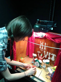
The Stop Motion
It's safe to say the part of the process I have enjoyed the most is animating the stop motion. This was my biggest assigned role from the start, and the part I wanted to experiment with and develop further.
In the end we managed to get 1 minutes worth of footage, which is about half of the full animation. The video below is an unedited version of the animation, David has edited this and looped parts of it to make it last longer, which works a lot better then the order I've put it in here.
Overall, I am happy with the animation I was able to produce; the main problem with it however - that a few people have pointed out - is the lighting. We used the florescent lights which constantly switch on and off about 50 times a second, normally used just to set up the stop motion pieces to then be switched off while animating. Apparently there are ways to fix this by either editing the photos or putting some sort of filter on so that the lighting looks to be on purpose, which we can always look into after the deadline.
Considering how stiff the models are, I feel that I have managed to move them fairly well; the characters were as I predicted earlier, stiff but manageable to manoeuvre. I think they were starting to take the strain towards the end, particularly the strawberry since she is the one who had to move the most; the drummer's arms or seating position weren't very stable but he could stretch further than the others; the lemon was hard to move but I only had to move his arms so I didn't have much trouble with him; the aubergine was the wrong proportion compared to his saxophone and couldn't move far so there were some issues there; and the orange's arms had a limited range but I think his motion works really well for this animation.
The animation is jagged in places but I can see as the sequence plays out, my animating improved. This in itself is an achievement for me, since my aim in every project is to improve my skills as an animator!


Thursday 14 May 2015
Editing the Title Sequence...
After receiving feedback from David and Grace, we decided that changing the font would look better. After looking through the fonts available on Premiere again, I tested out a few over one of the characters (highlighting the word 'Manny'):
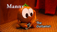
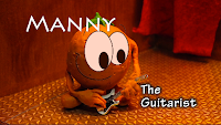
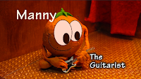

I am happy with the final font I chose; I think it looks a lot more professional then my previous choice, yet still quite bold. Despite this choice the white font doesn't stand out on the floor, which is only an issue with this character's shot, but it is still readable.
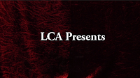
Another piece of feedback I got was that the text should be changed on the front of the curtain from "Introducing..." to "LCA Presents" or "Eating Healthy with Hi-Vit" (the film title) or something along those lines. My main issue with using the suggested line is that it isn't the Leeds College of Art who is presenting it, but rather the three of us who worked on it; and people might not understand the abbreviation of "LCA", especially children at whom this animation is aimed at.
Despite 'presents' sounding more professional than 'introducing', we would have to come up with a group name or simple way to introduce the show without leaving too much text to read. Using the song title could be a good idea but it will ruin the surprise of the band being behind the curtains. Either way I tried a few variations of text to go on the curtains:


Ultimately I still feel that using "Introducing" makes the most sense for this film, because it's introducing the stage with the band name on the back wall, as well as the characters, and my teammates reasoning for the other phrases are unexplained.
 |
| Fonts on Premiere |


 |
| The Final Font |
Another piece of feedback I got was that the text should be changed on the front of the curtain from "Introducing..." to "LCA Presents" or "Eating Healthy with Hi-Vit" (the film title) or something along those lines. My main issue with using the suggested line is that it isn't the Leeds College of Art who is presenting it, but rather the three of us who worked on it; and people might not understand the abbreviation of "LCA", especially children at whom this animation is aimed at.
Despite 'presents' sounding more professional than 'introducing', we would have to come up with a group name or simple way to introduce the show without leaving too much text to read. Using the song title could be a good idea but it will ruin the surprise of the band being behind the curtains. Either way I tried a few variations of text to go on the curtains:


Ultimately I still feel that using "Introducing" makes the most sense for this film, because it's introducing the stage with the band name on the back wall, as well as the characters, and my teammates reasoning for the other phrases are unexplained.
Wednesday 13 May 2015
RSA Animates... Documentary
This is a documentary style animation; since it's not necessarily factual but rather stating theories, but it's still portraying information in a time-lapse style. The hand drawing the images and text is keeping up with the narration, so the audience clearly knows what is being said and can see what the explanations mean with small diagrams.
In this particular animation, the narrator seems to waffle on about the theory of motivation, which is interesting to listen to but it runs for a bit too long. This way of portraying theories is the type of thing that is meant to make the audience think about what they have listened to more to build up their own theories on the subject; it would be a very good way to portray factual information as well since the pixilated hand could draw clear diagrams, charts and percentages in this efficient manner, whether it'd be interesting enough to watch or not is another matter.
In this particular animation, the narrator seems to waffle on about the theory of motivation, which is interesting to listen to but it runs for a bit too long. This way of portraying theories is the type of thing that is meant to make the audience think about what they have listened to more to build up their own theories on the subject; it would be a very good way to portray factual information as well since the pixilated hand could draw clear diagrams, charts and percentages in this efficient manner, whether it'd be interesting enough to watch or not is another matter.
60 Second Adventures in Economics
I found a series of short animations describing economics in an interesting way; these animations are narrated by David Mitchell, who explains a few dilemas the government have with taxing or where and when to spend money. It's an advertisement for the Open University to encourage people to study economics, so there has to be an entertainment factor to these short films.
The animation is stylised and simple black lines on cream background, so it doesn't take too much attention away from the narration, but assists in explaining what is being said. I think this is the right balance of imagery and information, because it's still entertaining despite it not being beautifully rendered or with realistic designs. The information is portrayed quite fast which could be hard to keep up with, but the animation does make it easier to understand; I think animation is the best way to portray information quickly, compared to a live action sequence for example, since I don't think a live action film would be able to flow so quickly.
The animation is stylised and simple black lines on cream background, so it doesn't take too much attention away from the narration, but assists in explaining what is being said. I think this is the right balance of imagery and information, because it's still entertaining despite it not being beautifully rendered or with realistic designs. The information is portrayed quite fast which could be hard to keep up with, but the animation does make it easier to understand; I think animation is the best way to portray information quickly, compared to a live action sequence for example, since I don't think a live action film would be able to flow so quickly.
Marketing
As part of the pre production phase, Grace took on the job of making the DVD case and poster:
Overall I think they both look good and suit the same style; I particularly like the poster because of its vibrant colours and simple shapes. the DVD case is a nice colour but I'm not sure if it will appeal to our target audience, children aged roughly 10, purely because the colours in the background look a little bland, but at the same time this makes the characters stand out.
 |
| DVD Case |
 |
| Poster |
Monday 11 May 2015
The Intro...
Unfortunately due to illness I haven't been able to do too much work over the weekend. However in order to ease myself back into animating, I thought I would get the title sequence done.
Initially I did the stop motion animation on this sequence, then sent it to David so that he could put the facial expressions on the characters, this is the combination of the two:
He purposefully left still images on each character as a gap to fit the name and occupation on; this turned out to be a good idea since it made it easier to cut the text in and out of the shot appropriately.
I decided completing this in Adobe Premiere would be the best way to develop my skills since I haven't used this software much and I can put into practice what my tutor taught the class about putting together a title sequence.
After importing the sequence above, all I had to do was create new title layers and put each character's name into position. There are a number of fonts available for all users, but I chose 'TektonPro White 34', because it has a soft black outline which makes the text stand out and suit the image well.
Since each character we recorded is in the centre of the shot, it was difficult to determine where the text should go, because putting it all to one side close together made the text-less side look quite empty.
I am happy with the final shot since the text doesn't take too much away from the rest of the image, but still portrays the information and is evenly spread across the shot.
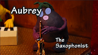 I tried to use the same font size and similar layout for each character's introduction, the only other two I had to play around with more were 'Aubrey' and 'Symphony'. At first with Aubrey I kept the text in the same position as with the orange; however the text covers up part of the face which I don't think works very well.
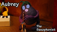 It would have looked better if the text was closer to the edges but this would take it out of the 'text safe' zone of the frame, so I compromised with the positioning. However I still feel that the final shot works well, despite it looking slightly different from the others.
Since there isn't enough space in the intro for a still shot of the strawberry, I decided to put some text on at the very end as she starts singing. Initially I wanted to put the text right next to her, like I did with the other characters, but something still didn't look right. If I had kept it where she was originally I would have had to keep the text smaller than on the other frames, so after trying some variations I thought the text in the top left corner looks better, since it's not overlapping any of the characters and it still makes sense as to who it's describing.


Initially I did the stop motion animation on this sequence, then sent it to David so that he could put the facial expressions on the characters, this is the combination of the two:
He purposefully left still images on each character as a gap to fit the name and occupation on; this turned out to be a good idea since it made it easier to cut the text in and out of the shot appropriately.
I decided completing this in Adobe Premiere would be the best way to develop my skills since I haven't used this software much and I can put into practice what my tutor taught the class about putting together a title sequence.
 |
| The editing box |
Since each character we recorded is in the centre of the shot, it was difficult to determine where the text should go, because putting it all to one side close together made the text-less side look quite empty.
 |
| An example of the text on one side |
 |
| The final shot |
 I tried to use the same font size and similar layout for each character's introduction, the only other two I had to play around with more were 'Aubrey' and 'Symphony'. At first with Aubrey I kept the text in the same position as with the orange; however the text covers up part of the face which I don't think works very well.
 It would have looked better if the text was closer to the edges but this would take it out of the 'text safe' zone of the frame, so I compromised with the positioning. However I still feel that the final shot works well, despite it looking slightly different from the others.
 |
| The final shot |


 |
| The final shot |
Once I had put all of the text in I exported it as a test to send to Grace and David for feedback:
I'm happy with the overall video; I included the "introducing..." text on the curtain as a way to introduce the band on stage (with the band name in the background) and the close ups of each character following, which I think works well because it's not too hard to read and builds up an atmosphere.
I showed it to a couple of classmates who were with me at the time I had finished this and they both said it works well, so hopefully more people agree!
Title Sequence Inspiration
Since I'll be putting text on the introduction, I thought I'd look at some other sequences from TV shows that incorporate text into their footage.
The Mad Men theme uses silhouettes with text flashing aside the images to introduce the programme. In my opinion though the font is easy to read, it flashes in and out of shot too quickly; this is understandable to get all of the information in but at the same time you can't tell what it's saying. However the way everything sits in the frame looks good and works well as a sequence; I've never watched the show but there could be a reason that the text moves so fast.
The TV show 'Game of Thrones' is a recently massive hit, just starting it's 5th season. Their opening credits are very well animated, giving off an eery atmosphere; The font used works well with the rest of the imagery.
The third video I picked is 'George of the Jungle'. It's a show aimed at children, so the colours used are basic and bright, with a fun theme song to go with it. Though there are moments where the contrasting colours flash at you (which are hard to watch) the use of text is good; it's mainly due to the way characters interact with it, such as pushing it aside as they swing. The font used has very straight lines and is covered with a thick, black outline, which suit the overall look of the cartoon style well.
Saturday 9 May 2015
The Final Crit
Since I wasn't there to present the developed animation yesterday (due to illness) I left it to David and Grace to get feedback from it.
We took on board some of the feedback we received previously; in the last couple of clips I started to move the stalks on the character's heads for example, which make the drummer more lively. Watching this shows me how well the animation's coming on; it's a shame that we don't have a lot of the animation to show so far but I'm hoping we'll be able to get a lot done this week. The animatic flows well and the animation fits in nicely to the right places.
Overall the comments sounded good based on a discussion I had with Grace and David; the main points were about summarising the facts we include in the animation so that they are easy to read and understand within the 5 seconds we have left for it, which we will discuss as a group when we are all back in uni.
Suggestions of sound effects such as a crowd screaming and the drummer's sticks when they are hit together were made, which I agree with and think it would bring the animation to life and make it feel slightly more realistic.
Since the first couple of audio tracks we had didn't work as well with the upbeat theme of the song, we decided to ask one of our classmates if she would sing for our video instead. Rebecca Wong's version of the song sounds nice and in tune, but the timing is slightly off. There are ways we can fix this though, if we re arrange some of the clips or loop them then we can make it work.
The lighting is still a problem to most people, we'll either have to find a way to make it feasible to keep or edit it out (which could potentially take too long) but we'll see what we can do.
Subscribe to:
Posts (Atom)